


I landed on the internet for the first time in 1996, and given my creative nature it didn’t take long before I wanted to have my own web site where I could present my programs and music.
At that point in time I didn’t know the first thing about HTML. Maybe I knew it was built up from tags, but that was pretty much it. So, it had to be WYSIWYG. I fiddled around with Microsoft FrontPage Express, but there was also some sort of WYSIWYG tool built into a specific version of Netscape (the browser of choice for me at the time) that could also build a web page.
I used that tool in Netscape to create my first web site in 1996, and it looked like this.
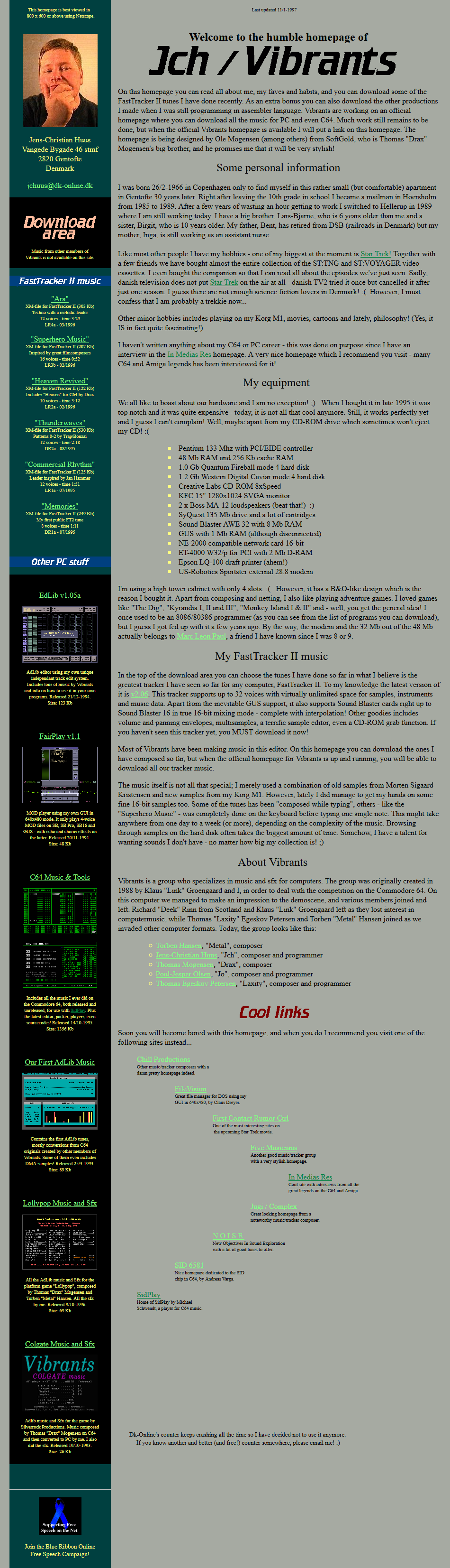
Lots of interesting text there, right? Whatever became of that Vibrants web site, Ole Mogensen was working on? I can’t remember the specifics anymore, but it wasn’t completed. Eventually Morten Sigaard (and later also myself) made the Vibrants web sites we had past the change of the millennium and beyond.
But that’s another story.
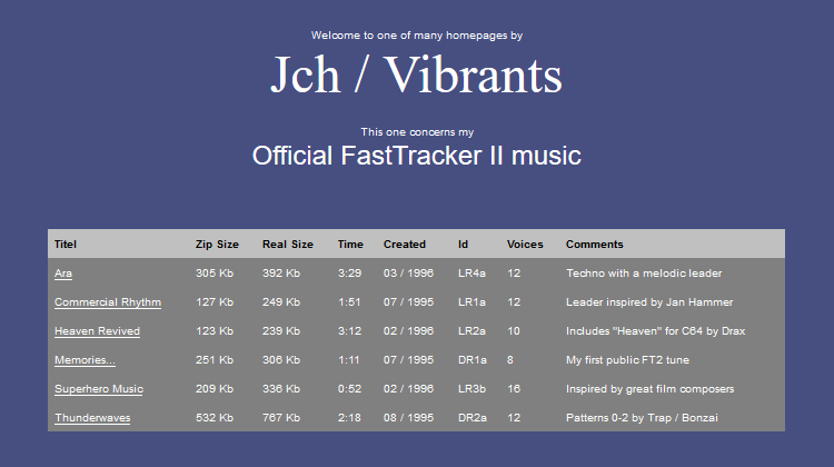
Also a bit amusing to see that I somehow felt it was necessary to reveal a lot of backstory. The beginnings, about my family, my interests. Combined with my still excessive use of exclamation marks, it made the presentation seem quite naive. Still grinning, huh? Let’s see your first web site!
Technically, there was one thing that was completely out of whack with that web site. See that dark green vertical banner from top to bottom? You would think I did that with some sort of DIV container, but I didn’t know what that was at the time. Instead I made a transparent hole in the one pixel tall background image and filled it with the dark green color. I had a lot of trouble making sure things were aligned properly on top of it. In fact, I believe it only looked properly in the original Netscape browser. I had to doctor the image a little to push things back into the dark green area, the way it was originally supposed to be.
Other web experiments
Especially during 1996-97, I regularly toyed with the idea of a new design. Some were very simple, others involved a lot of artistry. I was constantly in doubt about their viability and discarded most of it.
This first piece from January 1997 used the logo from the first web site.
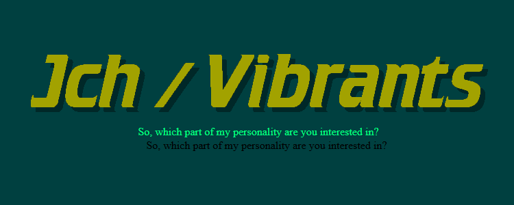
In April 1997, I did two graphically interesting web experiments. The first one was based on an idea of menu choices on post-its along with descriptions in a chalk font.
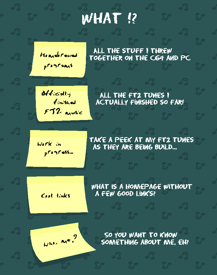
The second one was inspired by crazy action cartoons.
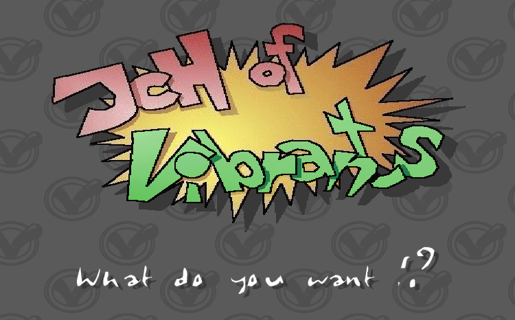
In May 1997, I had this idea of a logo where the shadow revealed a background image bending inwards.

Meh. The hell with it, I then thought and came up with something extremely simple.
But then in June 1997, I got the idea of text scraped into clay. The first design looked like this.
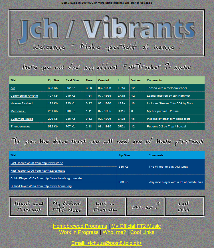
Finally an idea I thought was good enough to be used as my next web site. I developed it further to use faded images inside of the table cells (this was before CSS could do this for us) and put it online.
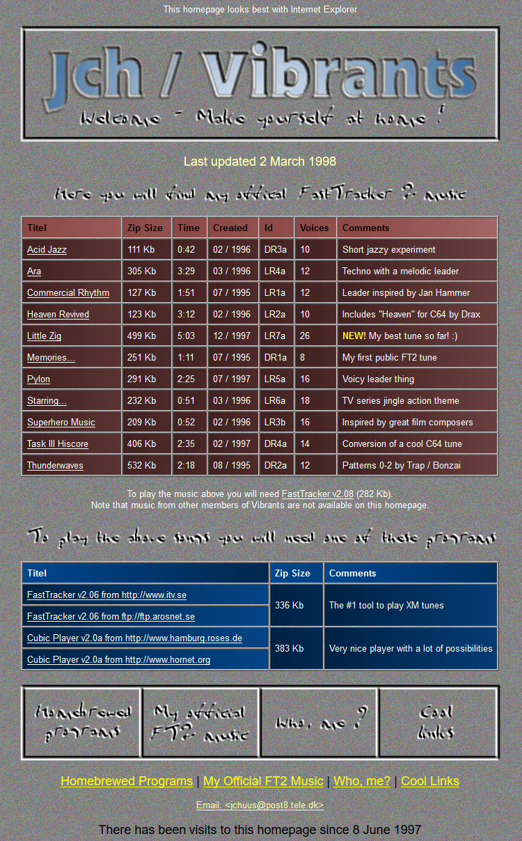
What’s up with “there has been visits to this homepage” in the bottom? Well, there was supposed to be a visit counter between “been” and “visits” but of course this didn’t work in the offline version I found.
Although I’m not 100% sure, I believe this was the web page that was eventually replaced with the JCHQ site I had for Half-Life mapping. But just as with the Vibrants web sites, that’s an entirely different story.
Unused web graphics
Back in the end of January 1997, I even drew a bunch of small images for use in a web page. I never found a place to put them and they remained unused. The image of a parrot was of course drawn on top of a photo, but the C64 ones had a lot of my own tweaking.


I hereby declare those final images as being public domain. If you think it’s something you could really use in a (non-commercial) product, knock yourself out.